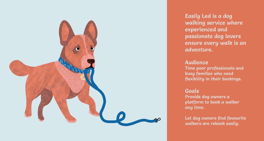
Easily Led
Credit: Image by rawpixel.com on Freepik
Responsive website design for User Interface Design course. User interface design, illustration and logo design for an imaginary dog walking service.
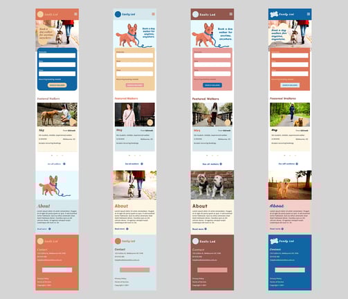
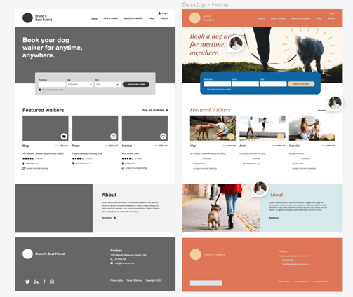
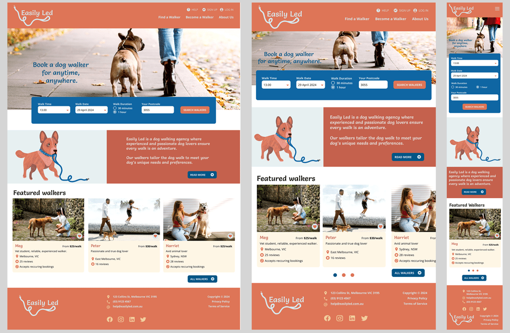
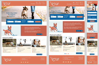
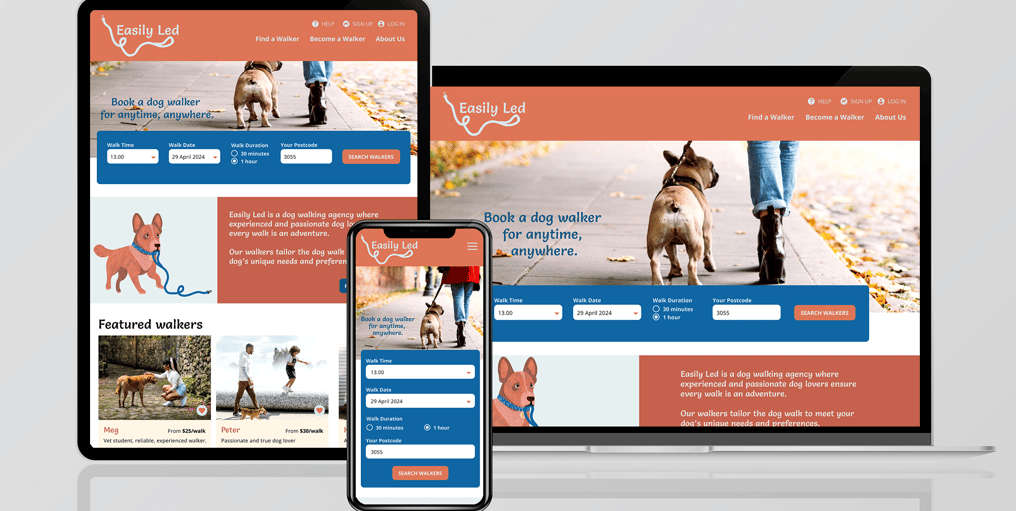
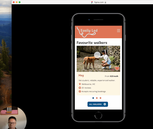
Using the mobile first approach, the design for the home screen (on mobile and desktop) was looked at with colour, typography and photography considered to create the right look & feel for the website.
Photography was mostly use, to create trust with the user, along with some illustration to add playfulness in the design.
This project for UI Design course began with supplied wireframes for four desktop screens, one mobile screen, user personas and user testing feedback.
The competitors were researched to see what photography, illustrations and icons were currently used by the industry.
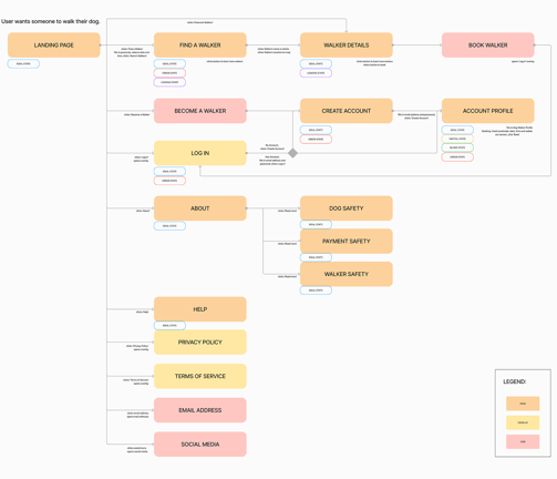
The user flow for the website was mapped out to include the four key screens (home, about, find a walker and walker details). Other screens were considered and added to the user flow as needed.
User flow
Mobile first approach
Design beginnings
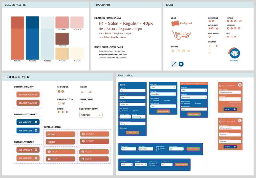
Component library
The colour palette, typography, icons, button styles and form elements for the project were created to form the basis of a component library.
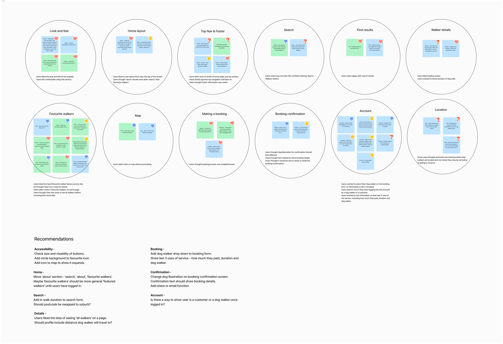
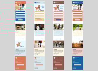
Usability testing (in person and via Zoom) was conducted, using Loom to record each session. Notes were taken and synthesised with an affinity map which created insights and recommendations for the next iteration.
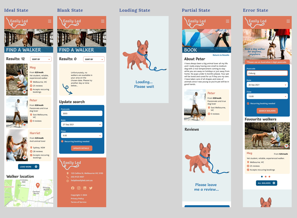
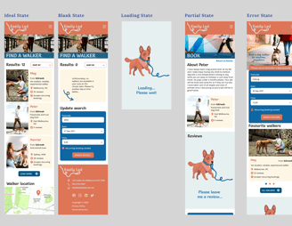
Each screen was designed, refining the components in each iteration. The UI stack of ideal, blank, loading, partial and error states was also considered.
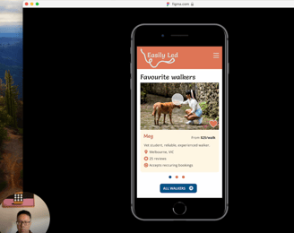
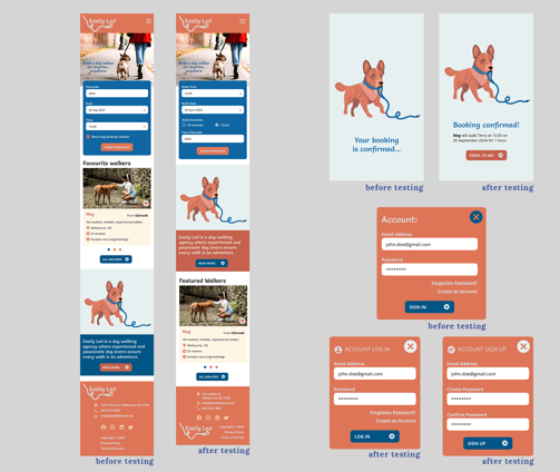
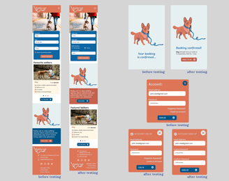
Once all screens were designed, a medium fidelity prototype for user testing was created.
Feedback from user testing was positive but indicated further refinement was needed on the search form, the account sign in form and the confirmation screen.
The navigation menu and the footer were refined. Any changes made in the mobile version of the website were also implements on the tablet and desktop versions.
UI stack
Usability testing
Iterations
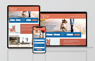
The final design included the home screen in desktop, tablet and mobile formats. As well as, all screens designed for mobile and turned into a clickable prototype.